8/26/2013

Hawaiian Blues


Dove McHargue did a nine-page story for Matt Dembick's comics anthology WILD OCEAN.

He asked me to do the lettering and title. This one was really fun. Completely different than the NEMO book. The story involves a pool, a whale, some peril, and a bit of fantasy.

Dove used a sort of bubble transition for the fantasy sequence, so I decided to do circle balloons as a sort of motif. The whole anthology is square, so circles seemed fair game.

It’s not something that I see very often. One of my favorite letterers John Workman did it for Paul Pope’s 100%:


8/19/2013

BARTKIRA Volume 5, Pages 276-280


I was delighted to be a part of a very odd project put together by James Harvey. It is called Bartkira. It overlays the world of The Simpsons over the entire epic manga series AKIRA (over 2000 pages) by Katsuhiro Otomo. Pages from all 6 volumes were divvied out, and key characters were replaced with Simpsons characters.
Strangely, my assigned pages had a bit of nudity and some potty-language. So that meant I had to draw a naked Simpson. For me, certainly a first; hopefully a last.
Color wasn't a requirement, but I felt that color is a major element in the Simpsons. I really only colored the characters, leaving the background as monochromatic.
Here's my set compared to the original pages. You'll probably need to click to get a better look:

 Harvey is still compiling all of the pages. Not a job that envy. Thanks James!

8/12/2013

NEMO Lettering


The actual lettering on the NEMO pages for Dove was much more fun. I did a previous test that was all by hand and I quickly realized that I wasn’t going to be able to fit all of the dialog and text into the art using my own hand-lettering (even after blowing up the work). So I decided to just hand-draw the balloons and use a digital typeface for the actual text. I’m adamant about drawing the balloons by hand (I’m actually using a cintiq).

Since Mark is writing I thought that it might be appropriate to mimic the scalloped ballooning of Xenozoic Tales:

Mark’s whole aesthetic is usually based in 1930-50s adventure comics/illustration, so that’s the lineage I’m referencing here (Al Williams' I, Rocket):

Art-wise Dove is taking a really interesting approach. He’s doing a sort of 20s/30s film look with the tones (post lineart airbrush).

Drawing balloons is my single favorite part of making comics, so this was pretty fun.


Dove and I had talked about using faint textures in the balloons that mimic the airbrushing he’s doing for the artwork. It seemed necessary to tie the balloons and art together. I much prefer this to making the balloons slightly transparent (a trend that is distracting I think). Dove scanned a few pages of airbrush tests and I used those to make the textures.

I don’t know that I love it, though... The textures printed way too dark when Dove printed a few samplers.

8/06/2013

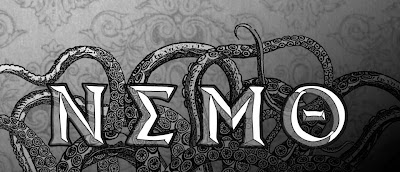
NEMO Logo


Dove McHargue asked me to help with the lettering on a project that he and Mark Schultz are working on. It's a sort of prequel to Twenty Thousand Leagues Under The Sea (the 1870 Jules Verne book). Dove started an earlier version of the project a few years ago. Now he and Mark and working out the narrative, Mark does a full script, Dove does the art, and I’m doing the lettering and typography.
The first order of business was to do a logo. First sketch:
I had intentions of finishing out the rest of the letters with cracks like on the bottom of the "O".
He said he was going for a greek/victorian vibe. So (perhaps in a too-obvious move) I used some greek letter forms as the basis for a set of letters. I gave dove a few options and narrowed it down. Dove had final choice:
In order to get the victorian vibe, I tried a bit of fabric pattern behind certain areas of of the letter forms. It didn’t make the final cut, though.
Here’s the final look in use by Dove:

I think the transparent elements are nice. Can I tell you how much I hate using Illustrator. Ugh. I just need to spend a few years using it, I guess.